BOJ Hawk Signals Faster Interest Rate Hikes Amid Inflation Risks
  U.S. Dollar Reaches One-Year High as Tech Sell-Off and Fed Rate Hike Expectations Support Demand
  WiseTech Global Denies Knowledge of Investigation Into Founder Richard White
  SK Hynix Moves Closer to New York ADR Listing Amid AI Chip Boom
  White House Seeks $87.6 Billion Emergency Funding for Iran War, Farmers, and Ebola Response
  Asian Markets Rally as Micron and Qualcomm AI Outlook Lifts Global Tech Stocks
  US Dollar Climbs to One-Year High as Fed Rate Hike Expectations Surge
  Samsung and SK Hynix Shares Jump After Micron Earnings Boost AI Chip Optimism
  New Zealand Fast-Tracks Gold Mining as Industry Revival Gains Momentum
  Oil Prices Drop as Strait of Hormuz Shipping Recovers
  KPMG Australia Chairman and Senior Partners Exit Amid Escalating Whistleblower Scandal
  Bessent Says U.S. Must Strengthen Supply Chains and Economic Security
  Gold Falls Below $4,000 as Strong Dollar and Fed Rate Hike Expectations Weigh on Prices
  Fortescue Faces Class Action Over Sexual Harassment Claims at Australian Mining Sites
  Australia Jobs Growth Strengthens Rate Hike Outlook
  Anthropic AI Model Uncovers Vulnerabilities in Classified U.S. Government Systems During Security Test


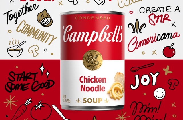
Campbell’s soup cans were redesigned for the first time in 50 years, so customers will see new labels when they purchase the popular canned soup products. While the color scheme remained white and red, the font may change a bit.
Changes on the design
CNN Business mentioned that the Campbell’s soup cans’ logo was also modernized but not much. The shadow in the emblem has been erased, and the font was slightly changed. The font was said to be based on the signature of its founder, John A. Campbell.
Moreover, the word “soup” is smaller and was written using a plain type of font. Images were also added to the new label depending on what type of soup it is. For tomato soup, it has a photo of a tomato on the side, and it is the same as the others, including the cream of mushroom soup and cream of chicken soup.
The Campbell Soup Company said that it upgraded the design for the new generation of customers. But despite the changes, the soup maker pointed out it "still evokes the same sense of comfort, goodness, and Americana."
Campbell’s NFT launch
In any case, Campbell’s also launched its NFT of its new can label. This is the company’s very first non-fungible token, and it started selling on Tuesday, July 27.
The company added that the earnings from the sale of Campbell’s NFT will be forwarded to Feeding America, a non-profit organization in the U.S. that has a nationwide network of over 200 food banks.
Meanwhile, Campbell’s new label’s NFT was created by Sophia Chang, an illustrator and street-style artist. The digital art will feature 100 Campbell's authenticated NFT art pieces that was titled “AmeriCANa - SOPHIA CHANG x CAMPBELL'S.”
"Some of the most famous pop art ever created was inspired by Campbell's red and white can -- the design is as much a staple of the grocery aisle as it is American culture," Chang said in a press release. "As a visual storyteller, I always am looking for new ways to express creativity. I wanted to hero the beloved label with keywords that connect to the brand for me while including a photo-real element of the fresh label to celebrate the new design.