OpenAI Expands Enterprise AI Strategy With Major Hiring Push Ahead of New Business Offering
  Amazon Stock Rebounds After Earnings as $200B Capex Plan Sparks AI Spending Debate
  BTC Flat at $89,300 Despite $1.02B ETF Exodus — Buy the Dip Toward $107K?
  Nvidia, ByteDance, and the U.S.-China AI Chip Standoff Over H200 Exports
  FDA Targets Hims & Hers Over $49 Weight-Loss Pill, Raising Legal and Safety Concerns
  Prudential Financial Reports Higher Q4 Profit on Strong Underwriting and Investment Gains
  TrumpRx Website Launches to Offer Discounted Prescription Drugs for Cash-Paying Americans
  Trump Backs Nexstar–Tegna Merger Amid Shifting U.S. Media Landscape


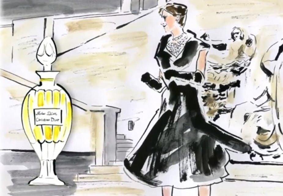


This year marks the 70th anniversary of Christian Dior’s first fragrance for women. It thus seems a suitable moment to examine the representations of women conveyed by Dior perfumes. We performed a semiotic analysis of the positioning strategies of four brands from the House of Dior: J’adore, Poison, Miss Dior and Addict.
Positioning as a marketing strategy

The couturier Christian Dior launched his first perfume in 1947.
Brand positioning is a key concept in marketing. By positioning a brand, marketers differentiate it from competitors in the consumer’s mind. The points of difference that are emphasised can be based on objective attributes (e.g., the durability of Volvos), but they may be completely imaginary (e.g., the Marlboro Man and his message that “real men” only smoke Marlboros). Positioning is crucial for brand identification, especially since it is well known that consumers tend to choose brands with an image and values they can or want to identify with. In other words, brands that resemble an ideal self.
The market for fragrances provides an excellent example of positioning strategies. As the very choice of a perfume is related to self-expression, touching on issues of gender representations and seduction, the positioning strategies in this sector are particularly interesting to explore.
Positioning strategies in the perfume sector
In the 1990s, the American semiotician Laura Oswald conducted a study on thirty high-end brands of perfume, including those from Calvin Klein, Chanel, Clarins, Clinique, Dior, Elizabeth Arden, Estée Lauder, Lancôme, Ralph Lauren and Yves Saint Laurent. In her analysis, she noted that the brand advertising strategies generally focused on different representations of women, doing so by calling on female stereotypes that consumers were likely to identify with. She observed two main types of positioning that corresponded to two very different interpretations of femininity: the “goddess” and the “girl next door”. She also found that these two types of positioning were related to specific visual codes.
Brands expressing the “goddess” image mostly made use of unreal and timeless backgrounds and the advertisements were rich in colour, texture and pattern. The camera angle, framing and background all worked together to place the model in a dreamlike space devoid of all human relationship. The “goddess” was thus represented as much admired but an unattainable ideal.
The brands expressing the image of the “girl next door”, on the other hand, sought to capture a “slice of life” of real women. The advertisements were mostly in black-and-white and the shots were framed more tightly, with realistic scenery and the models dressed rather simply. These women were usually interacting with another person, a man or a child. Although top models were featured, they portrayed an “everyday” woman anchored in real life.
Oswald’s study is still relevant in many respects. Notably, the brands J’adore, Poison, Miss Dior and Addict all use different representations of women in their positioning strategies. However, although the goddess image is still with us, Dior offers several interpretations of the feminine in their print advertisements that were not described by Oswald.
J’adore: An unattainable sun goddess
J’adore corresponds most to Oswald’s original analysis. First, the brand name itself anchors the perfume in the realm of the divine. The first meaning of the verb to adore is “to worship or honour as a deity”, and the visual codes in the advertisement are very close to those described in Oswald’s work. In the advertisement presented below, Charlize Theron is alone, emerging from the water, and is shot from a low-angle point of view.
According to the principles of intertextuality, the advertisement also evokes The Birth of Venus, adding another reference to the figure of the goddess. It is also interesting to note that several visual elements are presented vertically, enhancing the theme of elevation: the displacement of the letters of the logo, the actress’s posture and upward gaze, the dawn scenery, and the elongated shape of the bottle. Everything is designed to suggest that J’adore is a fragrance of divine essence that can elevate women to the status of goddess, turning them into objects of adoration.
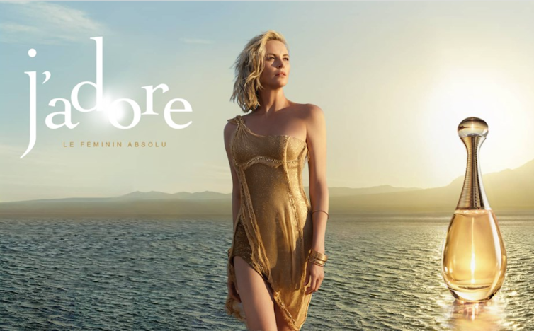
J’adore, le féminin absolu.
Poison: a female devil with a lethal power of seduction
Poison is the antithesis of J’adore in many respects. The name is negatively connoted and anchors the brand in a world of black magic and sorcery. This is obviously not to be taken literally but is rather a trope suggesting that the perfume is as dangerous and powerful as a poison. Poison is thus positioned as a weapon of seduction and activates a new image of the woman: no longer a goddess but a devil, succubus or “femme fatale”. The visual codes are related to this positioning, with torsion replacing elevation.
The shape of the bottle and stopper, the Poison custom typeface and the representation of the snake all illustrate this. This visual cue ‒ in addition to the word hypnotic and the posture and sultry gaze of Monica Belluci ‒ conveys the themes of seduction and bewitchment. Torsion indeed suggests a coiling and constricting force. Poison thus presents itself as a lure, suggesting that the women who wear it can take their victims captive.
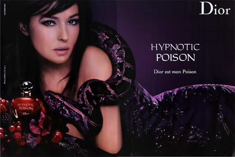
Hypnotic Poison, Dior est mon poison.
Miss Dior: a not-quite-well-behaved debutante
Miss Dior represents another image of femininity, more realistic but still fantasized. The name immediately anchors the brand in the universe of youth. Miss calls up the image of a young woman, whereas J’adore and Poison seem to address more adult women. The female representation conveyed by Miss Dior is realistic in that it does not conjure up a mythological creature like a goddess or devil. Yet, it doesn’t quite match the “girl next door” described by Oswald either. Miss Dior is always depicted in opulent interiors and thus embodies a “well-bred” girl of high social standing. Yet her youth and social status do not imply chastity.
In an interview, Nathalie Portman called her a “modern princess”, with “modern” here probably meaning “sexually liberated”. Indeed, recent advertisements show Miss Dior as increasingly scantily clad, even though the dresses recall the sweetness of doll’s clothing. The image conveyed is therefore paradoxical: although liberated, the modern princess remains waiting in her private palace for a prince to “free” her. The bow tie on the bottle is interesting in this respect as it may suggest an invitation to untie it. The other visual codes are consistent with the themes of “youth” and “high social standing’: pastel colours, flower patterns, and a cursive typeface for the logo.
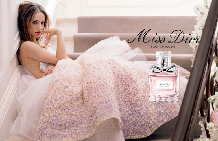
Miss Dior, blooming bouquet.
Addict: a woman in thrall to her desires?
The positioning of Addict is a bit more difficult to analyse. The marketing investment seems to have been smaller and the communication campaign is visually less coherent. The positioning is thus less clear and may have changed over time. Nevertheless, as for the other three perfumes, the name anchors the brand in a universe, in this case, addiction and dependence. The advertisement below is fairly unambiguous and indicates that the addiction is to sex. The model seems to be in the throes of a desire that she cannot control and evokes the character of Claudia Cristiani in Manara’s famous graphic novel series, Click. The image of women depicted here seems to be that of a "sex addict”. Yet, she doesn’t appear as a liberated woman. The tagline “Admit it” suggests that this hypersexuality is not accepted and the negative connotation of the term “Addict” suggests that it is a problem.
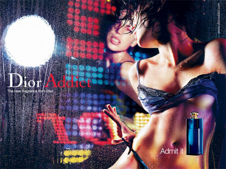
Dior Addict, Admit it.
The female stereotypes conveyed by brands in advertising have often been criticised. Here, it is clear that the representations conveyed by the perfume brands are somewhat archaic: ancient goddess, diabolical succubus, princess waiting to be freed and “sex addict” struggling against powerful urges. With the exception of the figure of the goddess, who transcends her feminine condition, these women do not appear completely liberated. If the devil of Poison asserts her power, it is only a power of seduction, with the implication of a need to please.
Erwan François observed that perfume brands could undoubtedly communicate more contemporary images of femininity: women as artists, activists, entrepreneurs, intellectuals, adventurers, and so on. It is nevertheless clear that the representations from Dior are mostly fantasies and should not be taken too seriously. The women consuming these products can indeed play with the proposed archetypes, or even reinterpret them, according to their own personalities. In this respect, it would be interesting to understand how female consumers actually appropriate the representations proposed by these brands.
This article was copyedited by Cathy Stott.
 Les auteurs ne travaillent pas, ne conseillent pas, ne possèdent pas de parts, ne reçoivent pas de fonds d'une organisation qui pourrait tirer profit de cet article, et n'ont déclaré aucune autre affiliation que leur poste universitaire.