SpaceX Updates Starlink Privacy Policy to Allow AI Training as xAI Merger Talks and IPO Loom
  Canada’s local food system faces major roadblocks without urgent policy changes
  Anthropic Eyes $350 Billion Valuation as AI Funding and Share Sale Accelerate
  Office design isn’t keeping up with post-COVID work styles - here’s what workers really want
  The American mass exodus to Canada amid Trump 2.0 has yet to materialize
  OpenAI Expands Enterprise AI Strategy With Major Hiring Push Ahead of New Business Offering
  The ghost of Robodebt – Federal Court rules billions of dollars in welfare debts must be recalculated
  SpaceX Reports $8 Billion Profit as IPO Plans and Starlink Growth Fuel Valuation Buzz
  Tencent Shares Slide After WeChat Restricts YuanBao AI Promotional Links
  Yes, government influences wages – but not just in the way you might think
  Stuck in a creativity slump at work? Here are some surprising ways to get your spark back
  TSMC Eyes 3nm Chip Production in Japan with $17 Billion Kumamoto Investment
  The Beauty Beneath the Expressway: A Journey from Self to Service
  Google Cloud and Liberty Global Forge Strategic AI Partnership to Transform European Telecom Services
  AI is driving down the price of knowledge – universities have to rethink what they offer
  Nvidia CEO Jensen Huang Says AI Investment Boom Is Just Beginning as NVDA Shares Surge


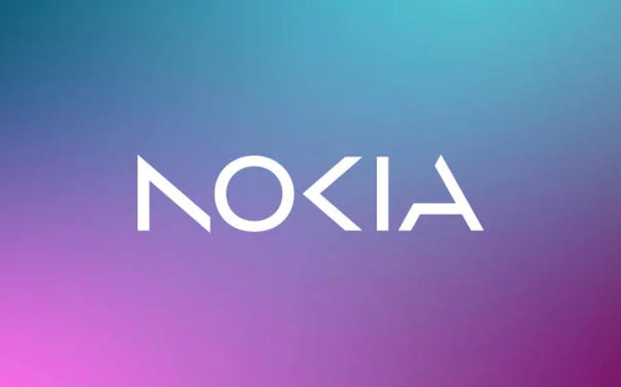
Nokia will change its brand identity for the first time in nearly 60 years, complete with a new logo, as it shifts from being associated with creating smartphones to being a business technology company focusing on aggressive growth.
The telecom equipment maker’s new logo comprises five different shapes forming the word NOKIA, with the iconic blue color being dropped for a range of colors depending on the use.
While Nokia still aims to grow its service provider business, where it sells equipment to telecom companies, its main focus is now to sell gear to other businesses.
After taking over the top job at the struggling Finnish company in 2020, CEO Pekka Lundmark set out a strategy with three stages: reset, accelerate, and scale.
Nokia is now beginning with the second stage.
After a 21 percent growth last year in enterprise, currently consisting about 8 percent of Nokia’s sales, or 2 billion euros, Lundmark said they aim to “take that to double digits as quickly as possible."