NASA's Artemis II Crew Arrives in Florida for Historic Moon Mission
  Annie Altman Amends Sexual Abuse Lawsuit Against OpenAI CEO Sam Altman
  MATCH Act Targets ASML and Chinese Chipmakers in New U.S. Export Crackdown
  Meta and Google just lost a landmark social media addiction case. A tech law expert explains the fallout
  SpaceX Eyes Historic IPO at $1.75 Trillion Valuation
  Federal Judge Blocks Pentagon's Blacklisting of AI Company Anthropic
  Cybersecurity Stocks Tumble After Anthropic's Claude Mythos AI Leak Sparks Market Fears
  Samsung Electronics Eyes Record Q1 Profit Amid AI-Driven Chip Boom
  Apple's Foldable iPhone Faces Engineering Setbacks, Mass Production Timeline at Risk
  China's Push to Steal Taiwan's Chip Technology and Talent Raises Security Alarms
  Britain Courts Anthropic Amid US Defense Department Dispute
  Microsoft's $10 Billion Japan Investment: AI Infrastructure and Data Sovereignty Push
  SMIC Allegedly Supplies Chipmaking Tools to Iran's Military, U.S. Officials Warn
  Reflection AI Eyes $25 Billion Valuation in Massive $2.5 Billion Funding Round
  OpenAI Executive Shake-Up Ahead of Anticipated 2026 IPO
  Apple Turns 50: From Garage Startup to AI Crossroads


Are you having issues with your wireless network at your office? If you are, you need to create a WiFi heatmap to find dead zones in your office. By carrying out a WiFi site survey, you will know which area in your office has the strongest and the lowest wireless signals.
Whenever you work on a wireless network that is expected to provide optimal coverage, having a solid understanding of the radio frequency's behavior at that spot is vital. The best – and most effective – way to determine this is to carry out a wireless site survey. A wireless survey reveals not only dead zones but also areas of channel interference. This can be done using a WiFi heatmapper known as NetSpot.
What is the goal of creating a WiFi heatmap?
Before discussing the primary goal of a WiFi heatmap, it is essential to know what it is. A WiFi heatmap refers to the color-coded, visual representation of invisible wireless signals used to deliver WiFi. It is produced using specialized software like NetSpot to visualize RF coverage within a given area.
WiFi heatmappers show the signal quality and strength throughout a particular space to verify that the WiFi design is optimal and sufficient to support wireless applications and devices. And that is the goal of creating a WiFi heatmap.
Heatmaps simultaneously showcase signal strength as well as quality for both of the WiFi frequency spectrums that the FCC has allowed for unlicensed use. These radio bands occupy the 2.4 GHz and 5 GHz frequencies.
However, the FCC has recently announced the opening of the 6 GHz spectrum to unlicensed WiFi use. This means that the capabilities of available WiFi coverage, bandwidth as well as overall performance will significantly improve over the coming years.
How to Make a WiFi Heatmap of Your Office
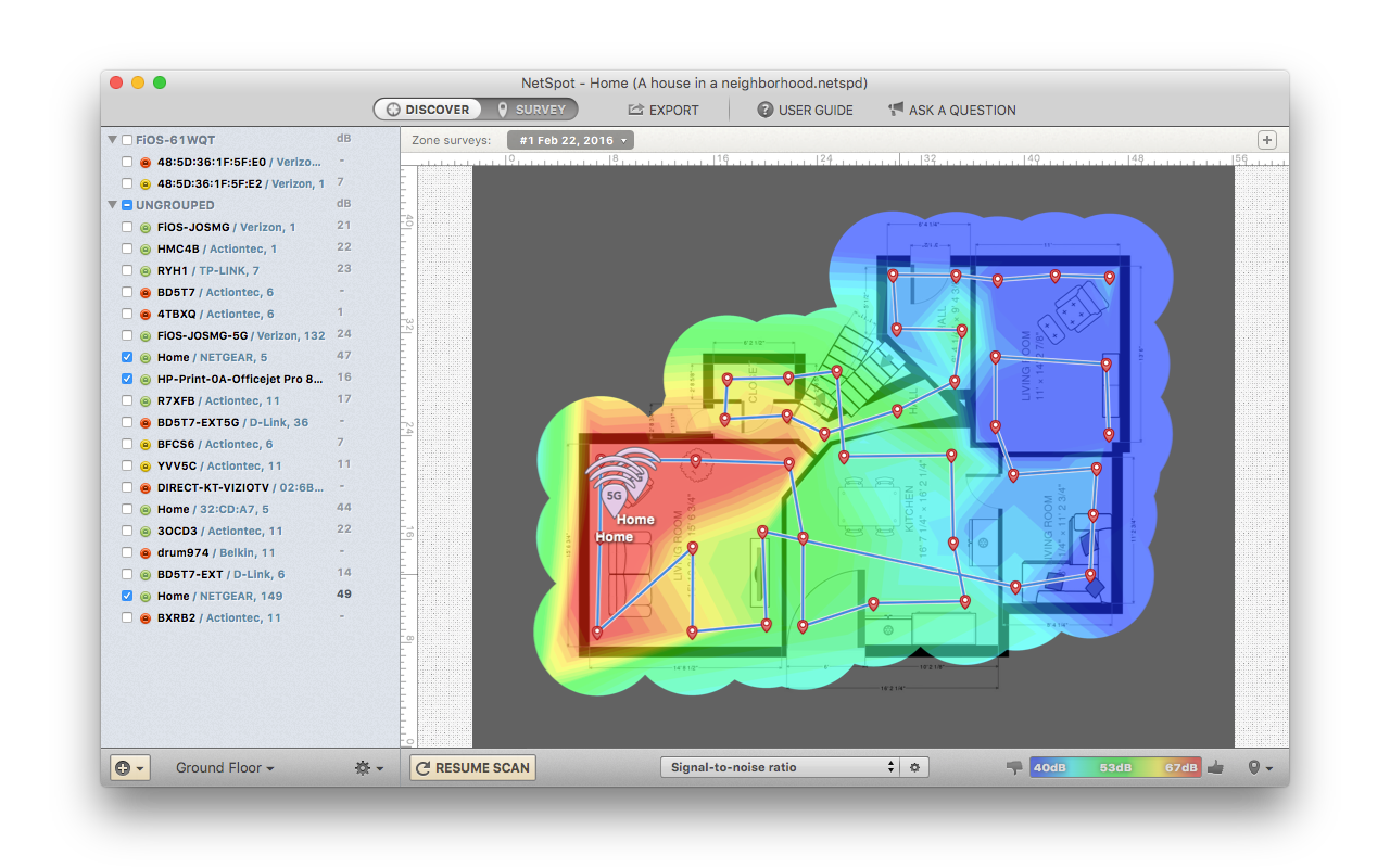
To make a heatmap of your office, you need a software app like NetSpot. NetSpot is the go-to WiFi heatmapper that comes with 2 unique WiFi analysis modes – i.e., Discover Mode and Survey Mode – and a simple user interface. It can be used on Windows and macOS.
To create WiFi heatmap using NetSpot, the first thing to do is to launch the application. Then, switch over to Survey Mode and click the ‘Start a new survey’ option.
Create a name for the survey project you are about to carry out. Make the necessary adjustments via the ‘settings’ and draw a map of your office or upload an existing one.
NetSpot will instruct you on how to walk from one spot to another on the map until you have covered every inch of your office space. Creating a highly detailed WiFi heatmap using NetSpot is quick and incredibly simple to use.
And the heatmaps can be swiftly understood at a glance. As you may have noticed, the NetSpot-generated heatmap showcases different spots with different colors. And these color codes are meant to inform you about the strength of the WiFi signal in your office.
For instance, the spot with the color red means that the WiFi signal is incredibly strong. The 'green' signifies the average wireless network, and 'blue' indicates that the WiFi signal is very weak. These are the 3 primary colors used to create a wide array of color gradients that depict rising or falling wireless signal levels.
The heatmap can also display what is known as SNR (signal-to-noise ratio). This compares the level of the wireless signal to the level of background noise usually produced by electronic appliances such as cordless phones, wireless video cameras, etc.
SNR does not include co-channel interference from other radio transmitters. This is where SIR (signal-to-interference ratio). SIR is readily available but comes in the premium visualization in the Enterprise or PRO version of NetSpot.
Other visualizations that are available within the PRO version of NetSpot include the number of access points, frequency band coverage, noise level, PHY mode coverage, signal level, etc.
How to Find and Fix Wireless Dead Zone
You can find and fix wireless dead zones by using the NetSpot app. When you launch NetSpot, it swiftly scans all WiFi networks nearby. For every network that NetSpot scans, it shows the signal strength, channel information, security type, and so much more.
This information is readily displayed right on the default ‘Discover’ view. Toggling the slider switch to move over to the ‘Survey’ mode, and you can build a heatmap of your wireless network.
While on Survey mode, you will be required to load up or draw a map of your office since that is the place you want to visualize. Click through one or two screens showing you options for the paid plans, and then click on the map in order to enter the first spot on the map. You will need not less than 3 locations.
After you have plotted your points, click ‘Stop Scan’ in order to see the results. Ensure that you check the list of networks within the left panel. You may notice that NetSpot has selected – at random – several networks from your neighbors. Therefore, uncheck theirs and click to select only yours.
After creating the heatmap, you may be able to select each access point individually. The map will display the signal from the access points you have chosen, depending on how many they are.
On the heat map, red spots or areas will be far from the router. But you may be surprised to discover that other unexpected dead spots even in spaces with relatively good signals. When you encounter such issues, find out why this is so and take the necessary steps to amend it.
When you are done, run another survey and create a new wireless heat map to see if the deployed solution worked. NetSpot is the leading WiFi heatmapper you need to help you towards a premium WiFi setup.
Conclusion
Finding dead zones in your office is not rocket science. As long as you have the NetSpot - WiFi heatmapper, you can quickly discover dead zones in your office.
This will enable you to make the needed adjustments to enjoy excellent coverage and wireless network reception. You will no longer be disturbed by constant drops in WiFi signal strength since the router is positioned in an optimal position for maximum and even coverage.
This article does not necessarily reflect the opinions of the editors or management of EconoTimes