


 Morgan Stanley Names Marks & Spencer Top European Retail Pick, Sees Strong Upside
  SK Hynix’s $28B U.S. IPO Draws Strong Demand as AI Chip Boom Fuels Investor Interest
  Elon Musk Says Anthropic Leads AI Race as Claude Models Challenge OpenAI
  Fast Retailing Raises Full-Year Forecast After Uniqlo Owner Beats Q3 Profit Estimates
  OpenAI GPT-5.6 Set for Wider Release After U.S. Commerce Approval, Report Says
  Oil and LNG Tankers Turn Back as Strait of Hormuz Security Risks Escalate
  Apple Tests China's CXMT Memory Chips as DRAM Maker Gains Global Market Share
  Wolfspeed Sues Navitas Over GaN and SiC Patent Infringement
  Bain Capital Exits Kioxia After AI-Fueled Valuation Surge
  Sino Biopharm Stock Rises After AstraZeneca Licensing Deal, GSK Partnership Expansion
  Kitron Q2 Revenue Beats Estimates as Defense Demand Lifts Growth
  AstraZeneca Shares Sink After Wainua Trial Misses Key Heart Disease Goal
  OpenAI Executive Fidji Simo to Step Down Amid Health Challenges Ahead of IPO
  Apple Sues OpenAI, Former Employees Over Alleged Trade Secret Theft
  Goldman AM Sees Strong Buyout Opportunities in Japan, South Korea and Australia
  Japan Regional Bank Stocks Drop After Zentoshin Bankruptcy Sparks Credit Risk Concerns
  Levi Strauss Raises 2026 Outlook After Q2 Earnings Beat, Shares Drop Despite Strong Results


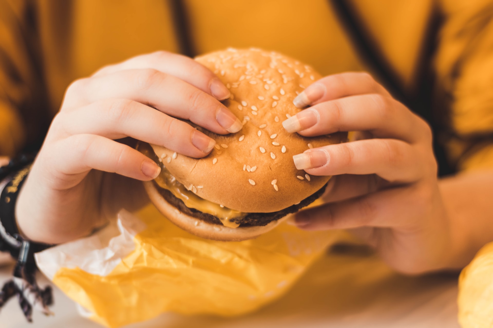
Burger King is offering something fresh as the new year begins. The American multinational chain of hamburger fast food restaurants company was founded in 1954, and as shared in its “About Us” page, it is the second-largest fast-food hamburger chain in the world.
The BK logo design history
In its 67 years in existence, Burger King only changed its logo about five times. The fourth design that was released in 1969 is probably the logo that has been used for the longest time, for it was only changed in 1994. From 1994 to 1999, the design was updated though the only difference was the more vivid color and the font.
From 1999, the Burger King logo that fast food diners know today has remained, but then, on Jan. 7, it was announced that the company has revamped its logo and package design. Diners will be surprised to know that the fast food chain simply reverted back to its design that was used in the 90s.
Burger King unveiled the new brand logo that shows the burger chain’s roots. All the packaging, uniforms, merchandise, and restaurant decor will not bear this emblem from now on. This is the first time that BK has changed its logo in the last 20 years.
The reason for the change and BK’s new commitment to a healthier menu
It was said that new designs were made to reflect the improvements in Burger King’s brand, including the elimination of preservatives in the food items it serves.
Early last year, Burger King announced that it will be going organic. They will be removing all forms of artificial ingredients such as preservatives and colors. All the outlets will now be sticking to an all-natural flavor of its Whooper burgers. This move was to introduce healthier options to its customers, as per The Washington Post.
"We've been doing a lot in terms of food quality and experience," global chief officer of Restaurant Brands International, Fernando Machado, said in a statement. "We felt that putting a wrap around all that with an upgrade of our visual identity would help signal to our consumers that this is a brand that's evolving."


