US Stock Futures Recover as Iran Signals Progress in Peace Talks
  South Korea’s KOSPI Rebounds as Samsung and SK Hynix Lead Tech Stock Recovery
  Bessent Says U.S. Must Strengthen Supply Chains and Economic Security
  Singapore Inflation Stays Muted in May as Core CPI Misses Forecasts Ahead of MAS Review
  South Korea Stocks Tumble as AI-Fueled Rally Faces Profit-Taking Pressure
  Malaysia Central Bank Moves to Support Ringgit Amid Foreign Fund Outflows
  Gold Prices Fall Amid Rate Jitters; Copper Steady as China Stimulus Eyed


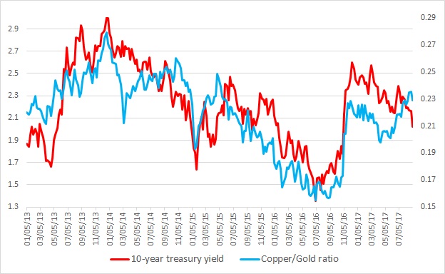
This chart shows the relation between the copper/Gold ratio and the U.S. 10-year yield constant maturity since 2013. It is visible even with the naked eye that the ratio and the yield have enjoyed a close relationship. Any divergence was temporary.
Last major divergence occurred back in 2014 when since March that year the ratio moved higher while the yield continued its decline. This continued until October before the collapse took place beginning November of that year.
What is the significance of the ratio?
- Copper is considered as an industrial barometer and pro-growth, while gold is considered as a safe haven and anti-growth. So higher ratio usually indicates increased economic activities, which in turn leads to higher interest rates/yield. Back in 2014, the ratio moved higher anticipating better than expected growth while yield moved higher but the ratio collapsed as the economy slowed down. Even the U.S. Federal Reserve had to lower its rate forecast.
Warning sign:
- A divergence is ongoing since April. The ratio has been moving higher while the yields are moving down. So the question is, how the divergence might end – higher yields or economic collapse.